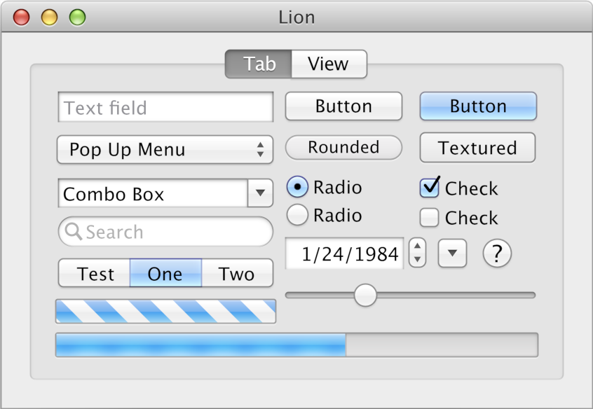
Louie Mantia lamenting the lack of standard UI in software these days:
Dan Counsell [on Mastodon]:

Can we please have the macOS X Lion UI back? 😍
Yes, I would also like that. I would welcome any standard UI that gives us back some tools we lost.
There’s a refined clarity to this version of Aqua. It evolved gracefully to this point, where every element was distinctly different and yet cohesive. Consider the search field alone. Now, search fields have the same appearance of every other field: squared. The pill shape distinguished itself. Removing that characteristic introduced a level of ambiguity that is unnecessary. The same can be said for so much in modern visual design (or lack thereof).
There really is a clarity to those controls. They have decent contrast, depth is used to help make it clear they are interactive, and there’s even some colour.
It’s a shame that the idea of standard UI seems to have been relegated to the history books with the move of more software to the web. Now every application needs to build its own component library more or less from scratch because the platform lacks a decent standard UI.
Design and fashion being cyclic, I wonder if in a decade or so we’ll see a return to interfaces with depth and character in the future instead of the grey flatland we have now.