Nikita Prokopov with a spectacular takedown of Apple’s use of icons in menus in
macOS Tahoe:
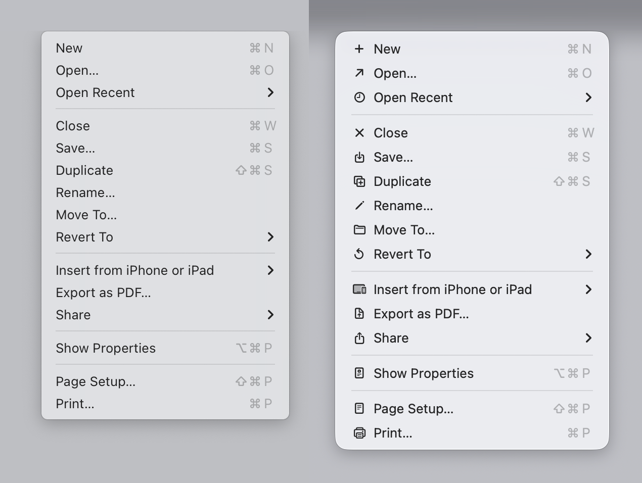
Apple releases macOS Tahoe. Main attraction? Adding unpleasant, distracting,
illegible, messy, cluttered, confusing, frustrating icons (their words, not
mine!) to every menu item:
Sequoia → Tahoe
It’s bad. But why exactly is it bad? Let’s delve into it!
The post brings receipts, lots of receipts. It’s an incredibly compelling
rebuttal to Apple’s reversal of it’s decades long guidance to not include icons
and other visual clutter in menus. As Prokopov points out, that advice dates
back to the earliest versions of the Human Interface Guidelines published in
1992.